PROJECT FOXCREEK POWDER BATH REVEAL

I just realized I never shared the reveal of this adorable powder bath with you guys. She is small but, mighty.

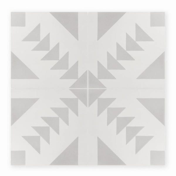
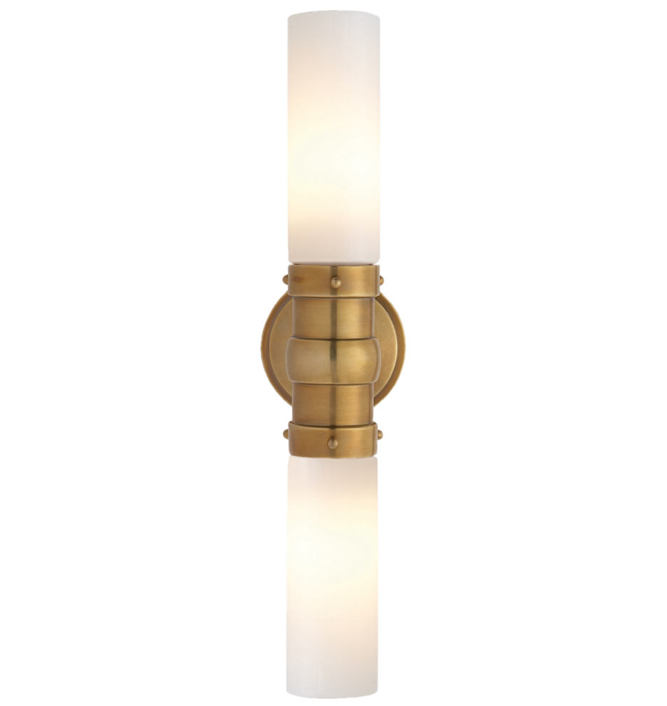
I love the hexagon floor tile and the fun pattern on the wall. Because those make such a statement, we kept it simple with the rest of this space. The round mirror and unexpected light fixture are the main focal point right when you walk in. They are the perfect choice to break up the straight lines of the tile. The dark brown stain on the vanity really warms up this room and lends itself to the boho vibe the client was going for.

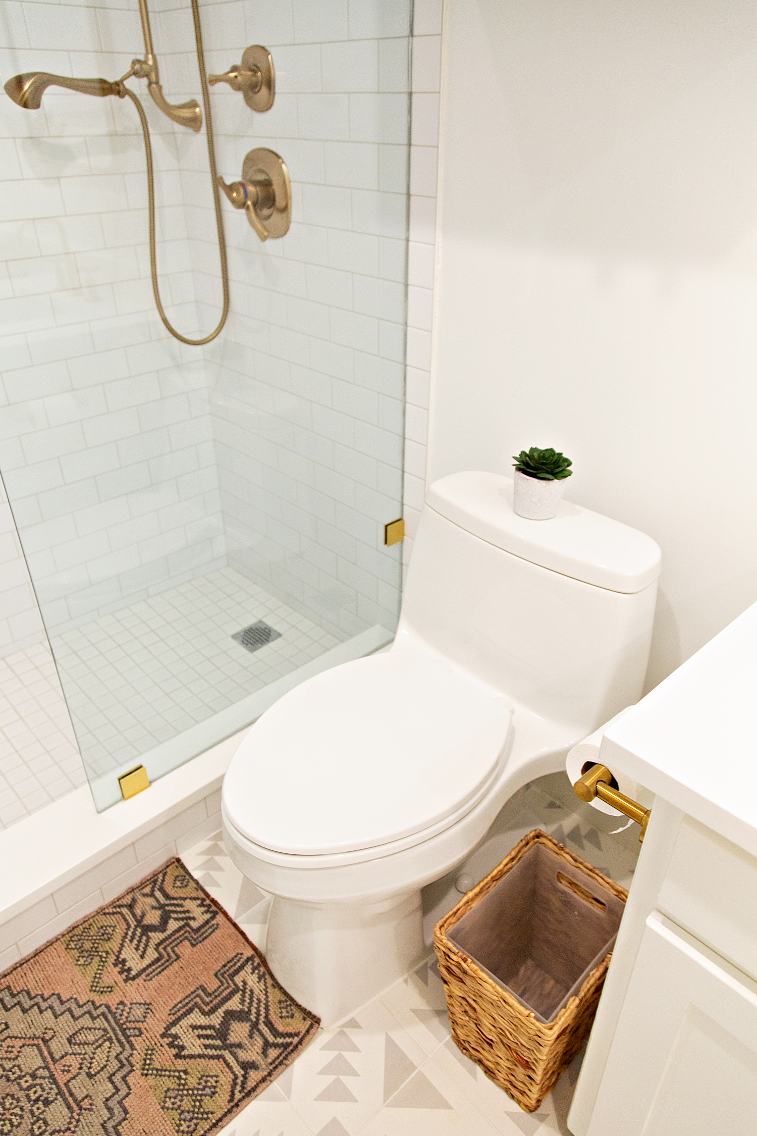
We all know it isn’t an Interior Girl space unless you add a vintage rug and we did exactly that. I found this baby at a local antique store for a steal. I knew it was meant for this powder bath. The colors and pattern are a fun unexpected addition.

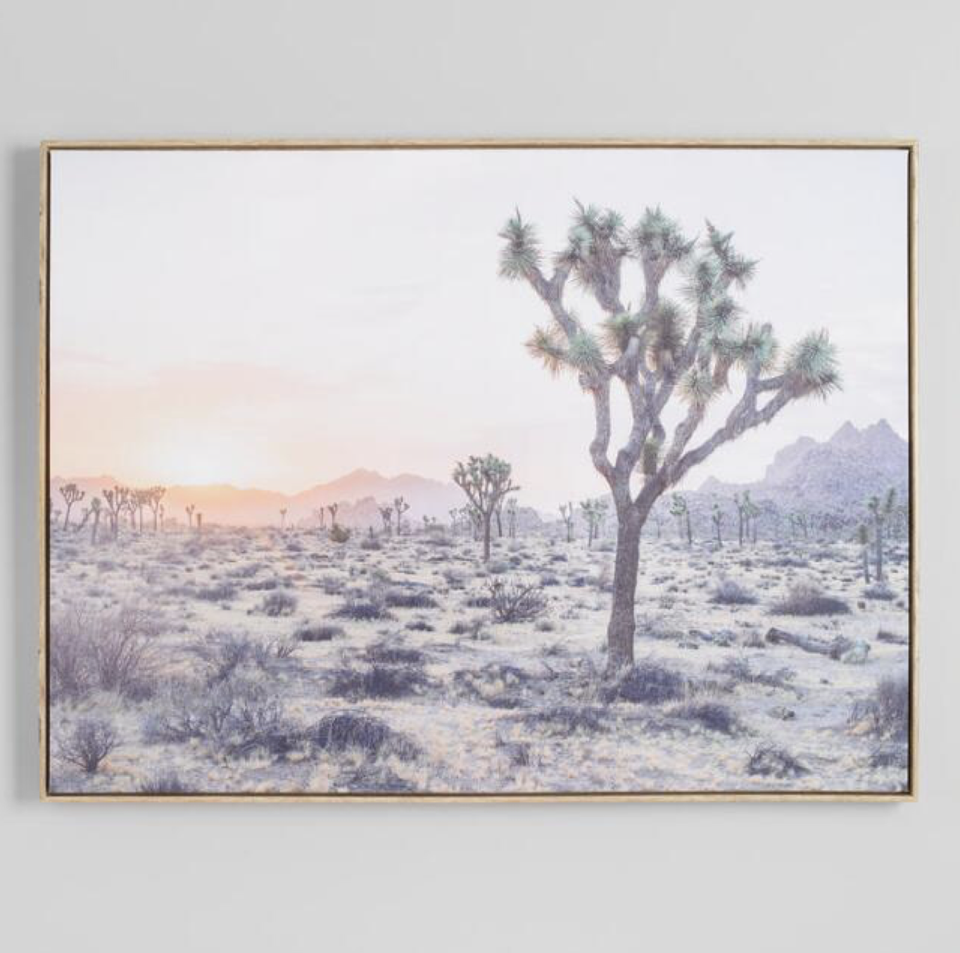
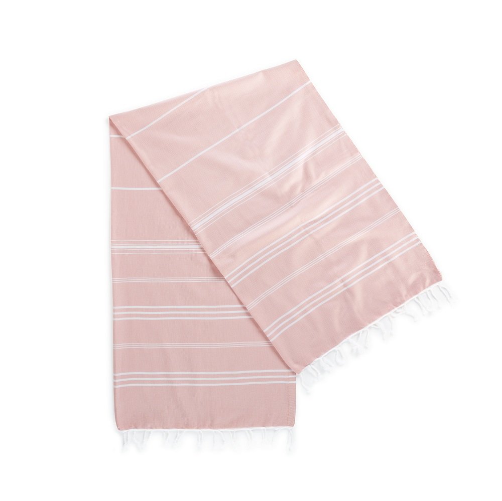
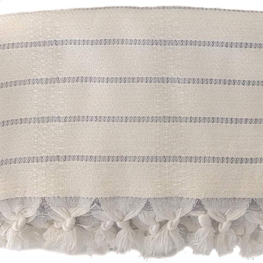
We brought in some pretty hand towels, a ladder to showcase larger turkish towels, a basket to store a backup vintage rug and some personal photography. The husband took these photos while on set at a photoshoot. I love conversation pieces like this for any space.

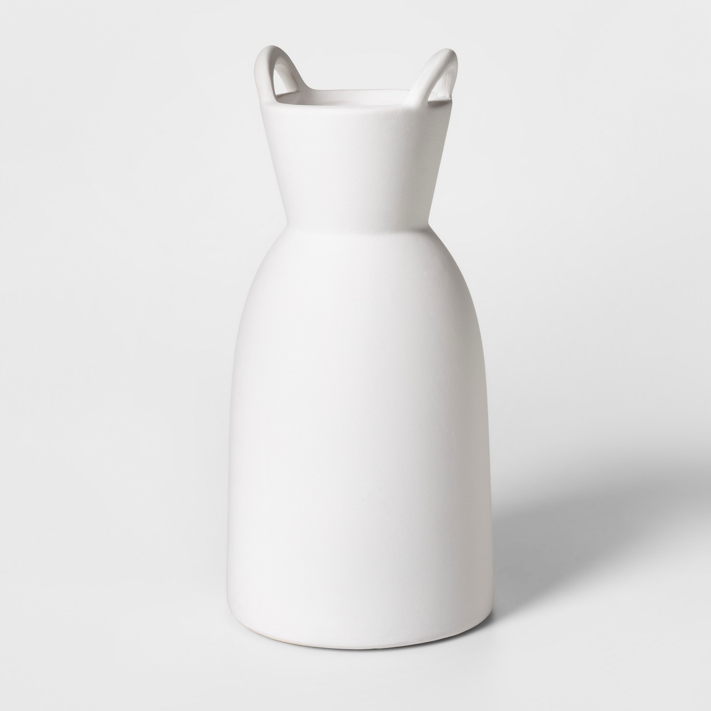
For a polished look, we put the soaps and lotions in a small tray on the counter and made sure the containers coordinated with the space. The final piece to the puzzle was adding some greenery. The client has a beautiful collection of succulents and plants around her house. I stole this one from her collection and I must say it is the perfect finishing touch.

So there it is my friends. The Foxcreek Powder Bath. She is a beauty!

Photo by Megan Weaver Photography

Photo by Megan Weaver Photography

Photo by Megan Weaver Photography

Photo by Megan Weaver Photography

Photo by Megan Weaver Photography

Photo by Megan Weaver Photography

Photo by Megan Weaver Photography

Photo by Megan Weaver Photography

Photo by Megan Weaver Photography

Photo by Megan Weaver Photography

Photo by Megan Weaver Photography

Photo by Megan Weaver Photography

Photo by Megan Weaver Photography

Photo by Megan Weaver Photography

CLICK ON IMAGES BELOW TO SHOP THIS POST.

AN INTERIOR DESIGNER'S BUDGET FRIENDLY HOME OFFICE REVEAL

To some this may be a silly before and after post. However, to me it is so much more than just a small space reveal. This is the small space that is making big dreams of mine come true. I have packed a lot of love into this little office and I hope you can feel it too.

As with most of my house I have done little to no construction. The bones are good but, they desperately needed to be refreshed. We updated the flooring when we first moved in. However, the office was not a top priority at the time. It has been sitting is this dark and depressing state for quite a while. Mac (my husband) finally got tired of me telling him how much I despised this room and agreed it was time tackle it.

I started by having the popcorn ceiling removed. I have done this once before on my own and I promised NEVER do that to myself again. This time I enlisted professionals. I am very fortunate that Mac is in the commercial paint industry so that part of the project was of very low cost to us. His team came in and removed the popcorn, sanded down the wood paneling and gave everything a fresh coat of white paint. One of my favorite crisp white paint colors is Sherwin Williams, Extra White. Almost my entire house is this color so it was a natural choice for the office. I went with a semi gloss finish on the wood paneling. That and Satin are typically what I use when painting wood. It is amazing what paint alone can do for a space. Don’t you agree? My go to saying is β€œThe Power of Paint” and I truly mean it. One of the most cost effective ways to update a space is to simply paint it.

Some other simple ways to update a space are to change out hardware, light fixtures, light switches and outlet covers. Doing these minor things make a huge difference and don’t break the bank. I did just this in my office.

Once all of that was complete, It was time to bring in the furniture and accessories. This space is tiny so I couldn’t really bring in much but, I was able to get the necessities in. If you know my style at all you know I like to mix new items with unique one of a kind pieces. I didn’t stray from this when approaching the design of my office.

One of my favorite finds for this office is the vintage rug. This was an Etsy find I almost missed. If you have ever tried to source a vintage rug you know this isn’t an easy task. Although there are millions out there, finding the perfect one that is the perfect size, shape, color, pile height, distress level and price can be difficult. I found this one and saved it to my favorites. I didn't jump on it right away because I was on the fence about the overall color scheme for the office at the time. When I finally made up my mind, a week later, the rug was gone! Not sold but, just disappeared. I tried contacting the shop however, they were on vacation. (Hate when that happens.) I was so bummed. I continued on with designing the rest of my office. I hoped that by the time I finished I would find a comparable option. No such luck.

Then one day, when I was searching for something else on Etsy, I went to my favorites and there was the rug. Not only was the rug magically listed again but, it was on sale! Gasp! It was like the Rug Gods had spoken and told me I needed this exact one. I bought it right away.

Because I know you are all wondering…… I reached out to the seller and asked her why the rug had reappeared. She informed me she has a store front in another state and had pulled it to sell there. However, she had and itch to put it back on the site a few weeks later. It was so serendipitous. This rug was meant to be the anchor in the Interior Girl Office. I love it so!!

Almost every vintage item in my office has some story like this. Those are the the priceless items that make a space interesting. Sprinkle those in with new retail purchases and you have a room that is fresh, has depth and is never boring.

So there it is. My home office makeover. My new favorite room in the house. It is simple yet functional. What do you think? I am VERY much in love with it. More importantly, I am in love with the possibilities this office holds. So much creativity has already been sparked between these walls. I can’t wait to see where this little room takes me. :)

This is what the office looked liked when we toured the home for the first time.

This is what the office looked liked when we toured the home for the first time.

The sanded down wood.

The sanded down wood.

Getting closer!

Getting closer!

The completed room. It feels so fresh and inspiring. πŸ“Έ Julie Hinojoza Photography

The completed room. It feels so fresh and inspiring. πŸ“Έ Julie Hinojoza Photography

This is an old Ikea desk that almost got tossed out. I am so glad I hung on to it. πŸ“Έ Julie Hinojoza Photography

This is an old Ikea desk that almost got tossed out. I am so glad I hung on to it. πŸ“Έ Julie Hinojoza Photography

One of my favorite views in the house. πŸ“Έ Julie Hinojoza Photography

One of my favorite views in the house. πŸ“Έ Julie Hinojoza Photography

Baskets are the perfect tool for storing rugs and drawings. πŸ“Έ Julie Hinojoza Photography

Baskets are the perfect tool for storing rugs and drawings. πŸ“Έ Julie Hinojoza Photography

This marquis sign adds fun to any space. πŸ“ΈJulie Hinojoza Photography

This marquis sign adds fun to any space. πŸ“ΈJulie Hinojoza Photography

I love putting unexpected objects on display. πŸ“Έ Julie Hinojoza Photography

I love putting unexpected objects on display. πŸ“Έ Julie Hinojoza Photography

I always add fresh plants when possible. πŸ“Έ Julie Hinojoza Photography

I always add fresh plants when possible. πŸ“Έ Julie Hinojoza Photography

I always style book shelves with vintage books, baskets and vases. πŸ“Έ Julie Hinojoza Photography

I always style book shelves with vintage books, baskets and vases. πŸ“Έ Julie Hinojoza Photography

CLICK ON IMAGES BELOW TO SHOP THIS POST. I HAVE LINKED SIMILAR ITEMS FOR ALL THINGS VINTAGE.

PROJECT GOODWIN AVE. E-DESIGN BOARD REVEAL

If you don’t know I am a retail designer by day and a residential designer by night. (everyday I am side hustling ) What this ultimately means is most of my residential client work is E-Design. When MY clients #projectgoodwinave reached out to me to help select furniture and decor for their new home I knew E-Design would be the perfect fit. I was so excited to work with them because our design styles were right in line and their beautiful house was the perfect blank slate. I had them send over images of their current space, dimensions of the rooms they wanted designed and images that depicted their design style. Once that was in my hands I immediately got to work. They needed my help with their living room, dining nook and home office. Since they were literally sitting on folding chairs we decided to start with the living room/ dining nook. The home office was important, but not as important as having somewhere cozy to sit.

I typically start with getting a feel for the needs and function of the space. The living room was long and narrow and needed to be broken up into two separate spaces. I decided to create an entry area as soon as you walk into the space. That area would then lead into the conversation/tv area. The space already had a beautiful fireplace in it and I knew that was going to be the focal. There wasn’t room in the budget for builtins, so I decided to dress that area up with dressers that would act as the media center and floating wall shelves flanking either side.

There is no dining room in this house, so the dining nook really needed to function as a formal/casual space. (No Pressure dining nook.) Although the space was small I knew it was going to be important to get a table that seated at least 4 people and comfortable chairs.

Once I determined how the space needed to function I got to work on a design inspiration board. When that was pulled together I emailed it to my clients to see if we were on the same page. We went through a couple of rounds because it turns out not everyone likes pink in their area rug. Ha! We finalized the design and I sent them their final package. This included their Design Board, Space Plan and a Shopping list with clickable links that reference back to the space plan.

Below are the final design boards we went with. If you follow my Instagram account then you have already seen the final reveal of this space. However, I thought you would like to see what goes into an E-Design Package.

You guys still haven’t seen the before’s of this space and to ultimately appreciate an after, you really need to see the before. I will be sharing a before and after post soon so keep checking back. You won’t want to miss it!

Entry

Entry

Conversation/TV area

Conversation/TV area

Focal Point

Focal Point

Dining Nook

Dining Nook


CLICK ON IMAGES BELOW TO SHOP THIS POST

PROJECT FOXCREEK BATHROOM REVEAL

When your client is a sassy corporate beauty professional by day and a jewelry sales woman by night she deserves restrooms equally as fabulous. Don’t you agree?

To be honest the whole process of designing this bathroom happened backwards. My client had already hired the contractor and demo had started. That is when she reached out to me with an inspiration picture and said she wanted the end result to look like the picture, could I help? Well, it just so happened I knew how to do that. Of course we didn’t make it look exactly like the picture, because every space is unique and deserves it’s own identity. We did however, pay homage to that inspiration picture. I must say, I love that we gave it it’s own twist.

This restroom is for her two sweet little girls. So we made it playful with a fun cement tile, images of cactus and pops of pink. We used a mini vintage rug as a bathmat and I will never use a traditional bath mat again. Not only is the rug functional but, it is so unique and beautiful.

Like I said previously I got involved later in the process than I typically do for a project, so I don’t have any before pictures. However, when the end result looks like this, who needs to remember the before? See below for the pictures of this girly bathroom and stay tuned for the reveal of this client’s powder bath.

Also, if you like what you see in this bathroom you may be in luck. I have a giveaway coming up and you are NOT going to want to miss it! Keep checking back to be the first to know.

Photo by Megan Weaver Photography

Photo by Megan Weaver Photography

Photo by Megan weaver Photography

Photo by Megan weaver Photography

Photo by Megan weaver Photography

Photo by Megan weaver Photography

Photo by Megan weaver Photography

Photo by Megan weaver Photography

Photo by Megan weaver Photography

Photo by Megan weaver Photography

Photo by Megan weaver Photography

Photo by Megan weaver Photography

Photo by Megan weaver Photography

Photo by Megan weaver Photography

Photo by Megan weaver Photography

Photo by Megan weaver Photography

Photo by Megan weaver Photography

Photo by Megan weaver Photography

Photo by Megan weaver Photography

Photo by Megan weaver Photography

Photo by Megan weaver Photography

Photo by Megan weaver Photography

Photo by Megan weaver Photography

Photo by Megan weaver Photography


CLICK ON IMAGES BELOW TO SHOP THIS POST.